A funny image alone doesn’t always create a memorable meme. Often, the difference between a meme that goes viral and one that’s ignored comes down to typography. Many creators spend time finding the perfect image but overlook the font, leaving their memes looking unpolished or difficult to read.
Choosing the best font for memes helps emphasize the joke, improves readability, and instantly gives your meme a recognizable internet style. In this guide, you’ll discover the most popular meme fonts, learn when each one works best, and see how you can quickly create professional-looking memes using HitPaw Edimakor.
Why Choosing the Right Meme Font Matters
The font you choose affects much more than appearance; it directly influences how viewers read and understand your joke. Using the best fonts for memes helps you:
- Improve readability : Bold, easy-to-read fonts ensure viewers understand the joke immediately, even on small mobile screens.
- Strengthen comedic timing : The right typography emphasizes punchlines and reactions, making memes feel more expressive.
- Create a recognizable meme style : Many successful meme formats use consistent fonts, making them instantly familiar to internet audiences.
- Increase social media engagement : Clean typography helps memes look more professional and encourages users to share them.
5 Best Meme Fonts and When to Use Them
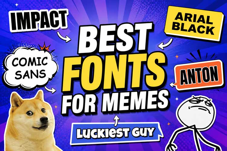
If you are looking for the right fonts to use in 2026, here are the top 6 trending options:
1 Impact – The Classic Meme Font

Font Style
Impact is a heavy, condensed sans-serif font with thick strokes and bold lettering. Its compact design allows creators to fit large amounts of text while maintaining excellent readability. Combined with the iconic white letters and black outline, it has become the classic look associated with internet memes.
Best For
Traditional image macros, reaction memes, viral internet jokes, caption memes, and nostalgic meme formats that immediately remind viewers of early internet culture.
Why It Works
Its bold appearance grabs attention instantly, making Impact font memes easy to recognize across nearly every social media platform.
2 Arial Black – A Modern Alternative
Font Style
Arial Black offers a clean, bold appearance with slightly softer edges than Impact. It maintains excellent readability while feeling more modern and versatile, making it suitable for both humorous and professional meme formats.
Best For
Corporate memes, workplace humor, educational memes, LinkedIn posts, and creators looking for a cleaner alternative to traditional meme typography.
Why It Works
Arial Black combines strong readability with a contemporary appearance, allowing memes to feel polished without losing their comedic impact.
3 Comic Sans – Funny Internet Humor
Font Style
Comic Sans features rounded, playful lettering originally designed for informal interfaces. While often criticized in professional design, its intentionally casual appearance makes it surprisingly effective for absurd humor and ironic meme formats.
Best For
Wholesome memes, intentionally awkward jokes, ironic internet humor (such as the viral cooked dog meme ), nostalgic content, children’s memes, hand-drawn MS Paint doodles, and exaggerated reaction images.
Why It Works
Comic Sans instantly creates a playful tone, making even simple captions feel more humorous and intentionally unserious.
4 Anton – Bold Social Media Style
Font Style
Anton is a bold display font with thick strokes and a modern geometric design. It delivers strong visual impact similar to Impact but with a fresher look that’s popular on today’s social media platforms.
Best For
TikTok memes, YouTube thumbnails, promotional memes, gaming content, and high-energy social media posts.
Why It Works
Anton stands out even on small mobile screens, helping memes attract attention while maintaining excellent readability.
5 Luckiest Guy – Best for Cartoon Memes
Font Style
Luckiest Guy is a playful display font featuring rounded shapes, exaggerated proportions, and cartoon-inspired lettering. Its energetic appearance adds personality and excitement to humorous content.
Best For
Cartoon memes, comic-style content, family-friendly humor, animated characters, gaming memes, and expressive reaction images.
Why It Works
Its exaggerated style enhances playful humor and gives memes a fun, animated personality.
How to Use Meme Fonts in Your Own Memes?
Finding the best meme font is only part of the process. You also need an easy way to combine images, text, and effects into a finished meme.
HitPaw Edimakor makes meme creation simple with an intuitive editor, customizable text tools, and a large collection of fonts, effects, and stickers. Instead of switching between multiple design apps, you can complete the entire workflow in one place.


Step 1: Import Your Image
Download and open HitPaw Edimakor. Create a “new project”. Import the image or screenshot you want to turn into a meme.
Step 2: Add Meme Text
Click the “Text" tab, choose the “Add Text” tool, and enter your meme caption. Keep the wording concise so viewers can understand the joke immediately.
Step 3: Choose Your Font
Browse Edimakor’s font library and select the style that best matches your meme. Whether you prefer Impact, Arial Black, or another bold typeface, choosing the right typography helps reinforce the tone of your joke.
Step 4: Add Effects
Enhance your meme with outlines, shadows, stickers, emojis, filters, or animations. These visual elements can make your content more eye-catching without distracting from the main joke.
Step 5: Export Your Meme
Preview your design and export it in high quality for sharing on Instagram, TikTok, Reddit, X, Facebook, Discord, or other social media platforms by clicking “Export”. You can export it as GIF.
Tips to Make Better Memes with the Right Font
Even the best font for memes won’t guarantee a funny result if the layout isn’t clear. Keep these best practices in mind:
- Keep Text Short:Memes are meant to be understood quickly. Short captions make the joke easier to process and more likely to be shared.
- Use High Contrast:White text with a black outline remains one of the easiest combinations to read across different backgrounds.
- Add Bold Outlines:Outlines improve readability when your image contains bright or detailed areas, ensuring the text stands out.
- Position Text Clearly:Place captions where they don’t cover important parts of the image. Most classic memes position text at the top and bottom for maximum visibility.
FAQs
A1: The answer depends on your style, but Impact remains the classic choice for traditional internet memes. If you prefer a more modern appearance, Arial Black, Anton, and Helvetica are excellent alternatives.
A2: Impact became popular because of its bold lettering, excellent readability, and ability to stand out against nearly any background when combined with a black outline.
A3: Many fonts are available under different licenses. Before using any font commercially, check its licensing terms or use fonts included with software that provides commercial usage rights.
A4: Many popular meme fonts are available through Google Fonts, Microsoft fonts, or other reputable font libraries. Some fonts, such as Anton, can be downloaded free for many uses, while others may have licensing restrictions.
Conclusion
Choosing the best font for memes can dramatically improve how your jokes are presented and understood. Whether you prefer the timeless look of Impact, the modern feel of Helvetica, or the playful personality of Luckiest Guy, selecting the right typography helps every meme stand out.
With HitPaw Edimakor, you can quickly add professional-looking text, customize fonts, apply effects, and export high-quality memes ready to share across your favorite social platforms.
Leave a Comment
Create your review for HitPaw articles